Redesign and evaluation of existing homepage and accessibility revue.
Project Summary:
Refurn.se is a webshop selling vintage furniture with a store in Lidingö. They focus on sustainability projects and offer high-quality reused furniture. They also provide consulting and networking for businesses interested in eco-friendly furnishings.
The Task: from Chas Academy during my study period to Redesign and improve the existing website. I found and decided to Refurn.se because it has big potential to improve.
Project Goals: UX Audit + Accessibility audit + UI design.
Issues found: Outdated, Misleading, Not responsive, do not hold accessibility standards (WCAG)
Team Members & Collaborators:
My My role – UX designer from start to finish (solo project).
Results
- Increasing User Engagement and Retention
- Improving Conversion Rates
- Boosting Brand Loyalty and Perception
- Facilitating Accessibility and Inclusivity

Problem
- Outdated websites can have security risks that lead to compromise sensitive information and damage the company’s reputation.
- Outdated designs lack modern UX principles, aren’t responsive, and don’t meet accessibility (WCAG) standarts. This makes the company seem outdated and unprofessional, leading to a loss of credibility and customer interest.
- The website misleads customers into thinking they can buy or reserve online. After registering, they find out they can’t, leading to disappointment and drop-offs.
Solution
- Regularly update software and plugins; implement SSL certificates, secure logins, and security audits.
- Modernize design and functionality with a comprehensive redesign, focusing on user research and usability testing.
- Adopt responsive design with flexible grids and layouts for all devices.
- Conduct an accessibility audit and meet WCAG 2.1 standards.
- Implement purchases without registration for a faster, more intuitive buying process.
- Provide clear, accurate information about the website’s capabilities and limitations
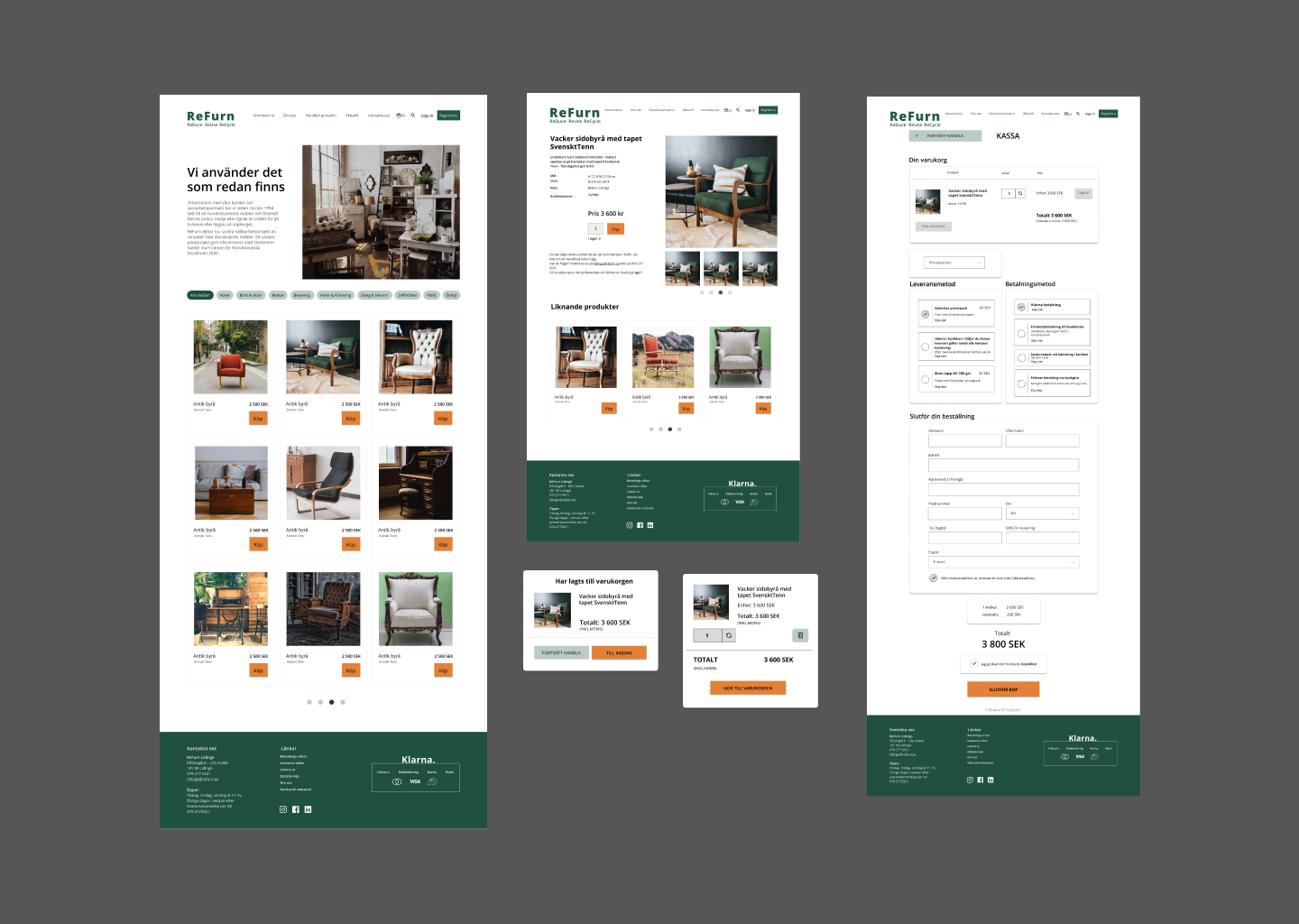
Final design
Process
- User research
- Accessibility Testing
- Usability Testing
- Competitive Usability Evaluation
- Problem Statements
- Customer Journey Mapping
- User Flow
- User Story mapping
- Concept development
- Sketching
- Wireframing
- Prototyping
- Accessibility document
- Usability testing
- Accessibility testing
- Heuristik evaluation
- Launch / Planing
- Jira Backlog
User Research & Testing
I conducted user research that included interviews, and usability tests on the existing homepage, ensuring alignment with user expectations.
The feedback gathered was pivotal in iterating on the design, improving both functionality and user satisfaction
Market & Competitor Analysis
To position the redesign competitively, I performed competitor analysis, examining key industry players. I identified strengths, weaknesses, and opportunities which informed design decisions that helped to improve design.
Competitive Usability Evaluation
I conducted competitive usability evaluations by benchmarking the homepage against competitor websites. This provided valuable insights into best practices and common usability pitfalls, allowing me to refine the design for an optimized user experience.
Accessibility Testing
- Low color contrast between text and background.
- Font Size too small a specialty in navigation
- Hard to reed on mobile, scalable but horizontal skrolling.
- Linked image missing alternative text.
- Missing form labels.
- Redundant links - Adjacent links go to the same URL
- Skipped heading levels (assistive technologies and SEO)
- Missing Focus Indicators
Usability testing
Visual Consistency
Coherent Image Sizes and Styles
- What Happens: Product images and other visual elements maintain uniform dimensions, aspect ratios, and quality across the site. Images are cropped or framed similarly to maintain balance, and styles (such as filters, borders, or color grading) are consistently applied.
- Why It’s Important: Consistent image sizes and styles create a polished, professional appearance. If images are mismatched in size or quality, the site can look disorganized or untrustworthy. Visual consistency in pictures ensures that the presentation is clean and well-organized, reinforcing brand identity.
Visual Hierarchy problem
What Happens: When important elements like headlines, buttons, or images don’t stand out, users have to work harder to process the information. This can happen if everything looks visually similar, or if there’s no clear structure leading the eye.
Why It’s Bad: A higher cognitive load results in users feeling overwhelmed and more likely to abandon the page. This can increase bounce rates and reduce user engagement with the content or products.
Misleading information
Loss of Trust and dissapointment
Users expect the information on a website to be accurate and reliable. When they encounter misleading information, such as false claims, incorrect pricing, or exaggerated benefits, they lose trust in the brand or product.
Once trust is broken, users are less likely to return, make purchases, or recommend the service/product. This directly affects conversions and long-term customer loyalty.
Poor User Experience (UX)
Misleading content can cause confusion and frustration, as users may not find what they expected or may feel deceived by unclear or exaggerated messaging.
Confused or frustrated users are more likely to abandon the site, leading to higher bounce rates and lower engagement metrics. This hurts the site’s overall performance and may result in negative feedback.
CTA Button”show the interest” insted of “buy”
After finding button show the interest insted of buy users feel big disapointment, but chansing to klick on the button.
They get the poput message with the bad contrast that disapier after 6 seconds. They missing to reed it.
Problem Statements
“Outdated website poses significant security risks, compromising sensitive customer information and damaging the company’s reputation.
The design lacks modern UX principles, is not responsive, and fails to meet accessibility standards, making the company appear unprofessional and outdated.
Additionally, customers are misled into thinking they can purchase or reserve items online, only to find after registration that they cannot, leading to frustration and high drop-off rates.”
Customer Jorney Map
Identifying Gaps and Opportunities:
I developed a customer journey map to visuallise the complete user experience for first-time visitors in the purchasing process.
This helped me to identify pain points, discover opportunities for improvement, and understand the emotional triggers that contribute to user drop-off.
User Story Mapping
Prioritisation of Features:
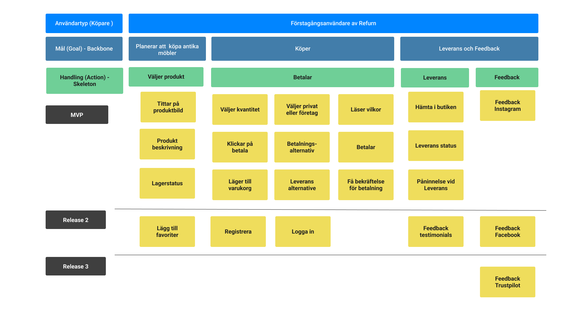
By organising user stories into a map, I prioritised features according to their significance in achieving user goals and meeting their needs.
This approach ensures that the most valuable functionalities are developed first for the Minimum Viable Product (MVP), while also identifying enhancements that can be implemented in future releases.

Concept
Visual Enhancements
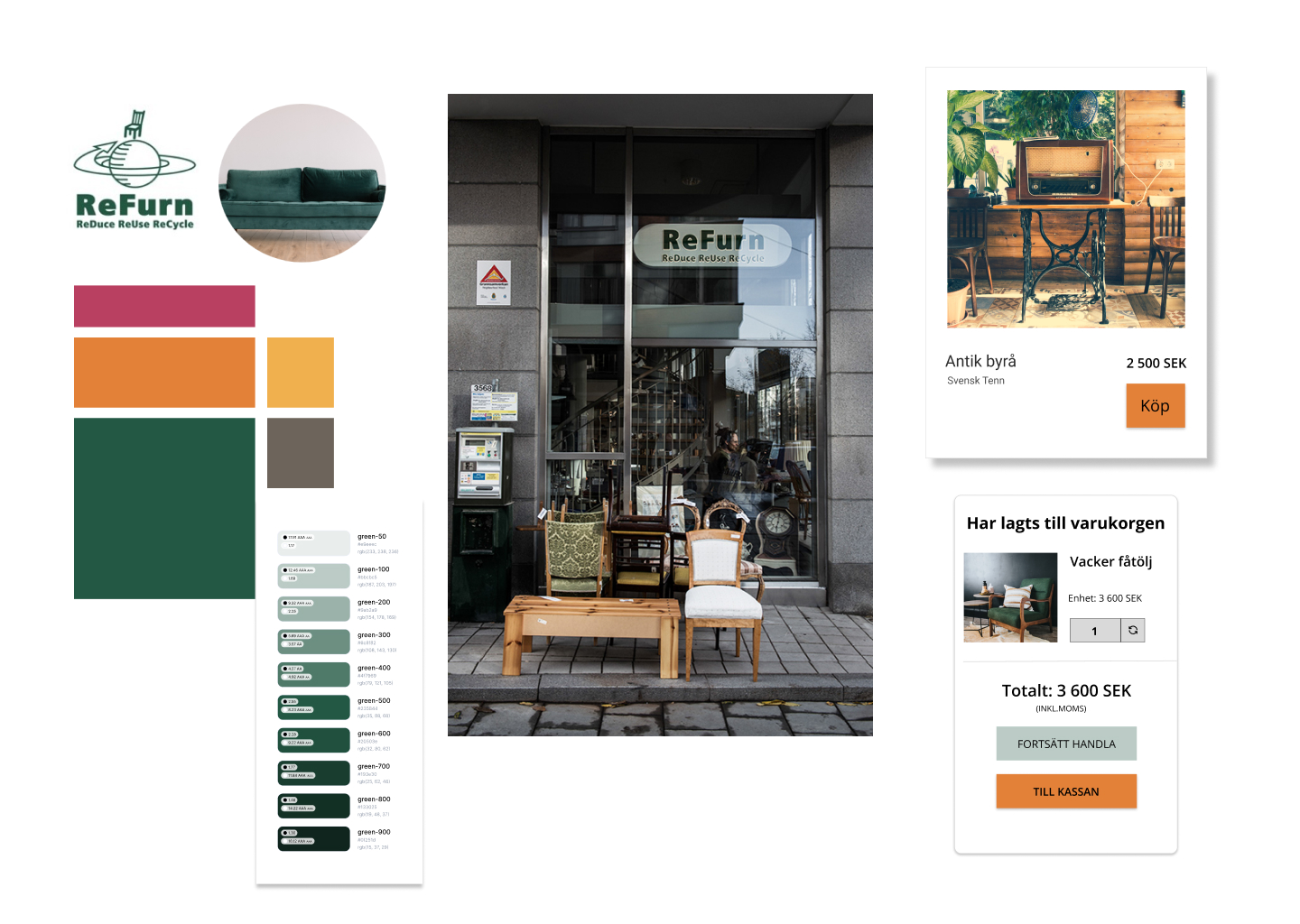
Concept styleguide and design system used as a basis inspired from Refurn’s own logo color and the design of their website.

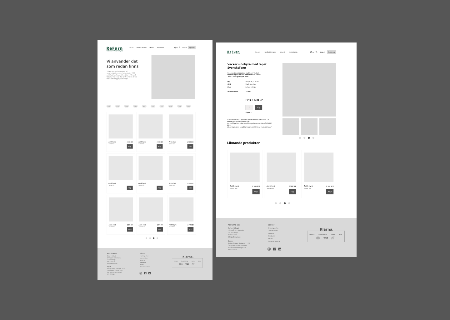
Wireframes

Prototype

Next step
What is next step ?
To drive more traffic to the newly designed site, focusing on SEO optimization for better search engine rankings would be key. Additionally, improving website load times and performance, especially for mobile users, would enhance the overall user experience and help with retention.
Learnings
What I have learned:
It’s challenging to work on a project alone, as you miss feedback from colleagues and different viewpoints. However, at the same time, you learn a lot, prove your competence, and find new ways to justify your decisions.
It’s also challenging without the opportunity to speak with business owners and stakeholders. I have many ‘why’ questions about real situations. I tried to imagine myself in their position and conduct research using other methods and resources.
How I will uplay in future:
In the future, I’ll apply the skills I’ve gained from working independently by confidently validating my decisions, even without direct feedback. I’ll use creative research methods and ask the right questions to ensure my work aligns with user needs and business goals, even when stakeholders are unavailable.


