Change from left menu navigation to top menu
The Task: To do research and user testing on change from left menu to Top menu navigation and prototyping in Figma.
Project Goal: To enhance user experience, improve usability, and optimize accessibility for Learnpoint’s LMS platform.
Team Members & Collaborators:
My role – UX designer.
Results
- Reduced Development Costs and Time
- Enhanced Competitive Advantage
- Facilitating usability
- Improved User Engagement
Problem
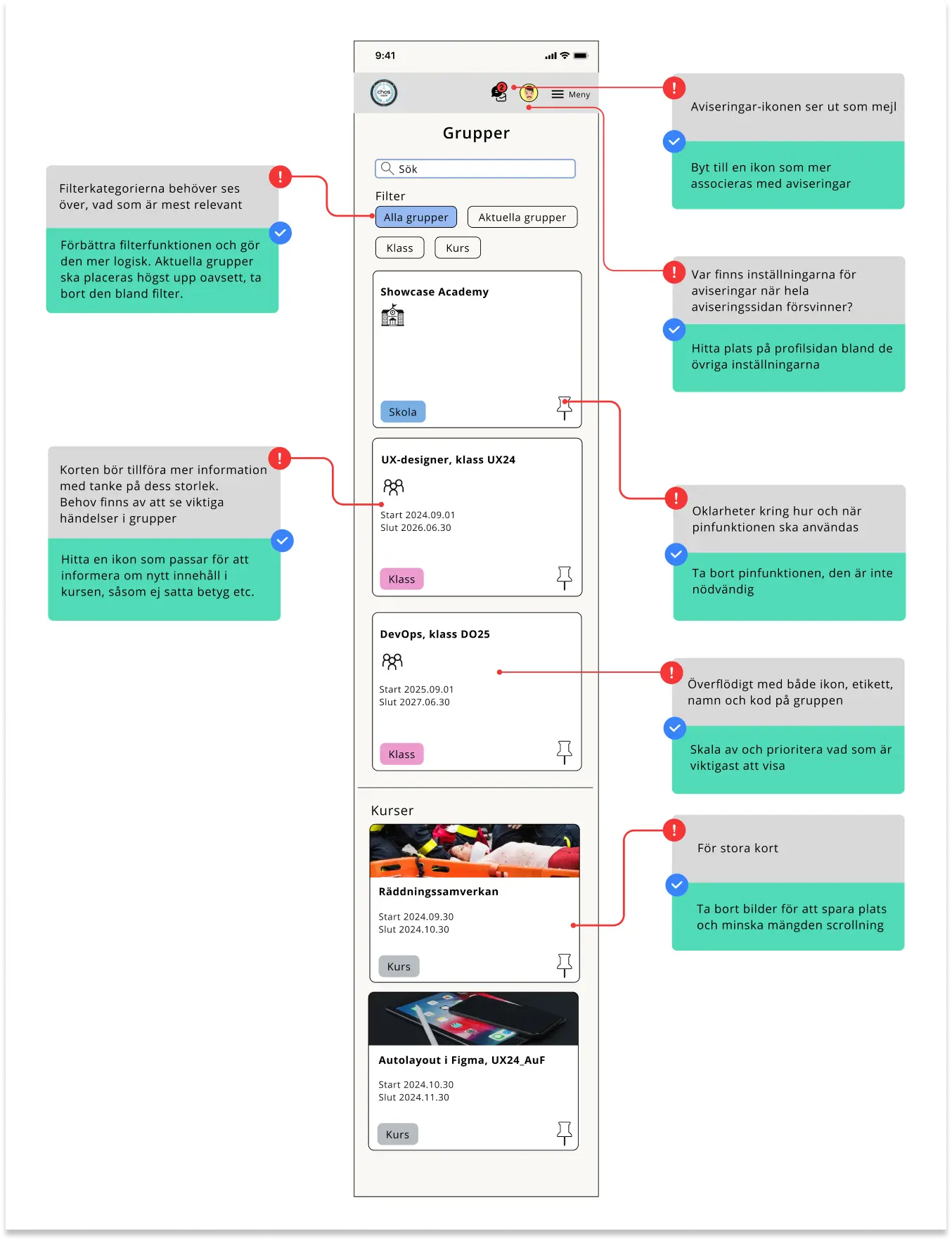
- Notifications are not visible if you navigate away, leading to missed important information.
- The aesthetic of the dark color in the existing left menu is perceived as too serious and boring.
- Need a homepage with all groups and classes.
- The filter needs to sort, filter, pin, or bookmark.
Solution
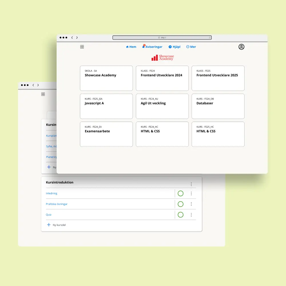
- Top menu that gives learners a visual impression.
- Improved functionality of notifications in the top menu, visible from everywhere. Quick overview of incoming notifications.
- Homepage with groups in the form of cards that can be sorted, filtered, and pinned if needed.
Research
Stakeholders interview
Interview stakeholders including sales and support teams who know the users best and the company’s needs.
Competitive Analysis
Most LMS platforms use a left-side navigation menu as a best practice, while only a few rely on top navigation. Some of them remove the top menu on scroll, keeping only the second-level menu for relevant content. Others make the page title sticky instead of using breadcrumbs. Itslearning is unique among LMS platforms for using only a top menu. What makes it risky to change.
The analysis highlights a strong need for change and test of changes before implementation to improve the user experience.
Prototyping and testing
Usability testing – Prototype 1 A/B testing.
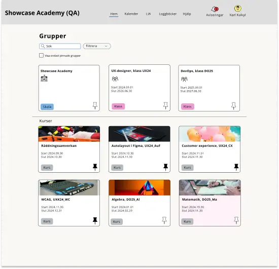
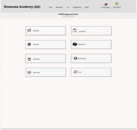
Usability testing – Prototype 2 A/B testing.

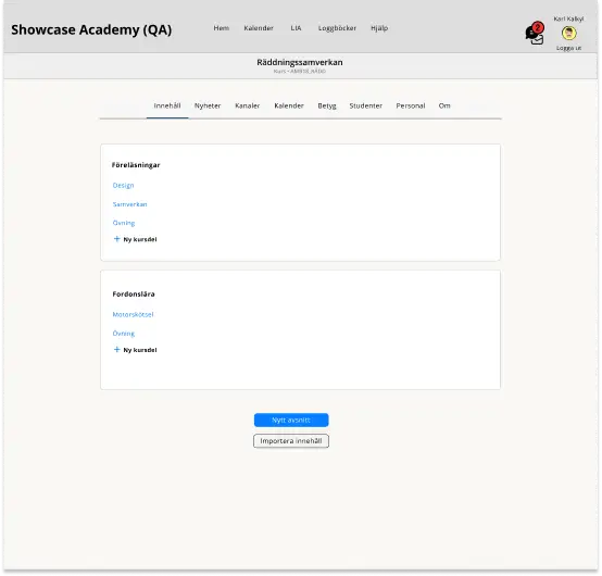
User testing and Iteration
Lorem ipsum dolor sit amet, consectetur adipiscing elit. Ut elit tellus, luctus nec ullamcorper mattis, pulvinar dapibus leo.
